KP's Case study
Full package for a law firm from Warsaw
Client
Services
Smuw Staff
KP Consulting
- Branding
- Web Design
- WordPress Development
- Bart Andrzejewski, Product Designer, Developer
down
Project outline
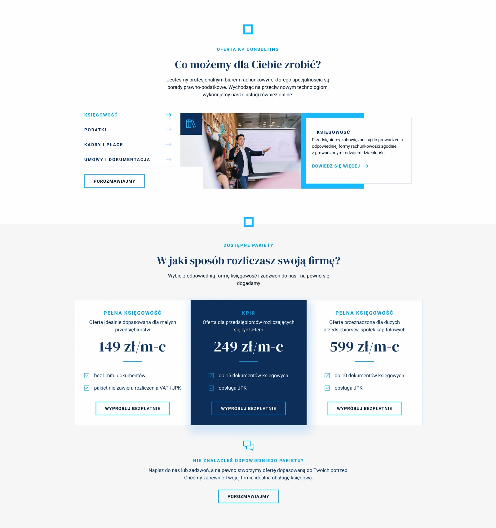
Here's a project that transforms the online showcase of legal services. We've developed a sophisticated website for KP Consulting, a distinguished legal office in Warsaw, seamlessly merging user-friendly design with robust functionality. Our goal was to establish a professional online presence, reflecting the firm's youthful spirit & modern approach to legal consulting and advisory

Main mission
Elevate the brand & improve lead generation
The project’s goal was to create a modern and polished website that effectively showcases the firm’s services clearly and straightforwardly for visitors. Both the old branding and website were outdated and mundane, prompting the need for a refreshing change for KPC. We aimed for an appealing and user-friendly design, particularly when navigating various pages. Maintaining a blue theme to align with the industry, We incorporated animations and bright blue highlights to infuse the site with a livelier and more energetic feel


Branding
(Not) a typical add-on. Out of the box rectangle

Details
KP stands for Kempt Presentation*


Kamil Kempisty, Co-founder of KP Consulting
Right from the start, Smuw tuned into my vision and collaborated seamlessly to make it a reality. Guys from Smuw were not only professional and efficient but also a joy to work with. The personalized attention I got was impressive; Bart was always there to address my questions and provide guidance. The end result exceeded my expectations. My new website not only looks great but is also user-friendly, earning positive feedback from clients and colleagues. I highly suggest Bart for exceptional web design services, especially considering we have new projects in the pipeline.
to open